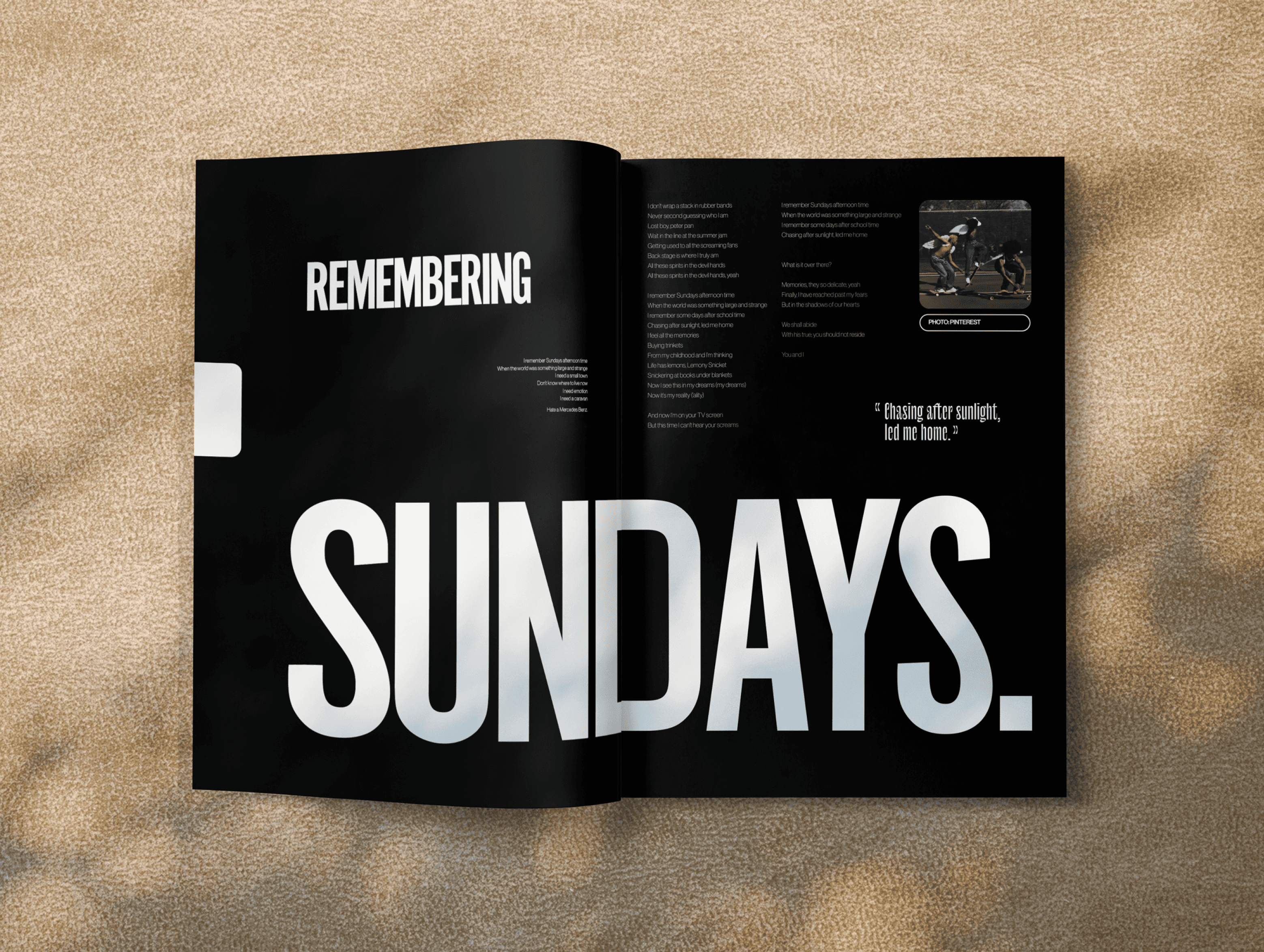
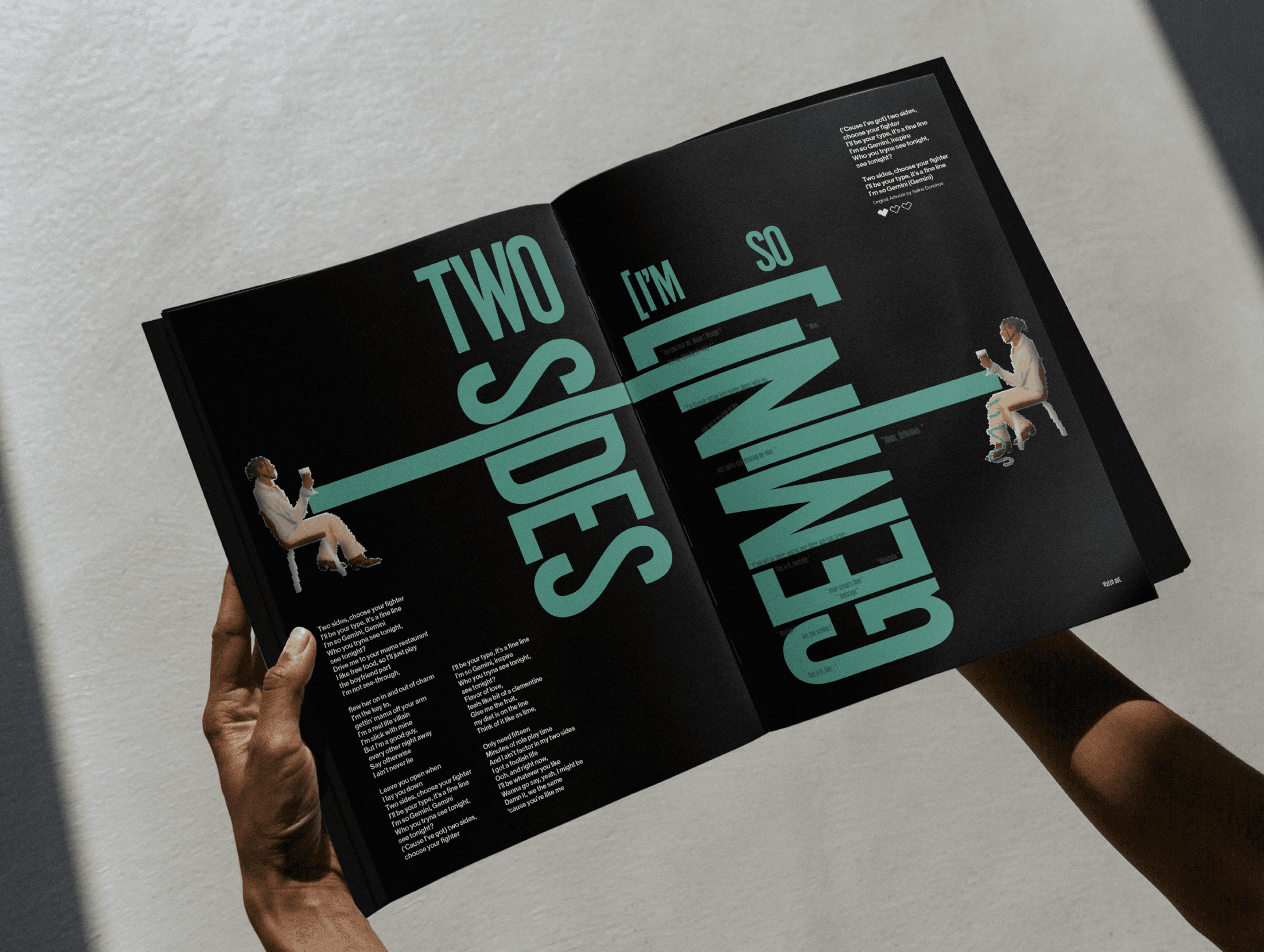
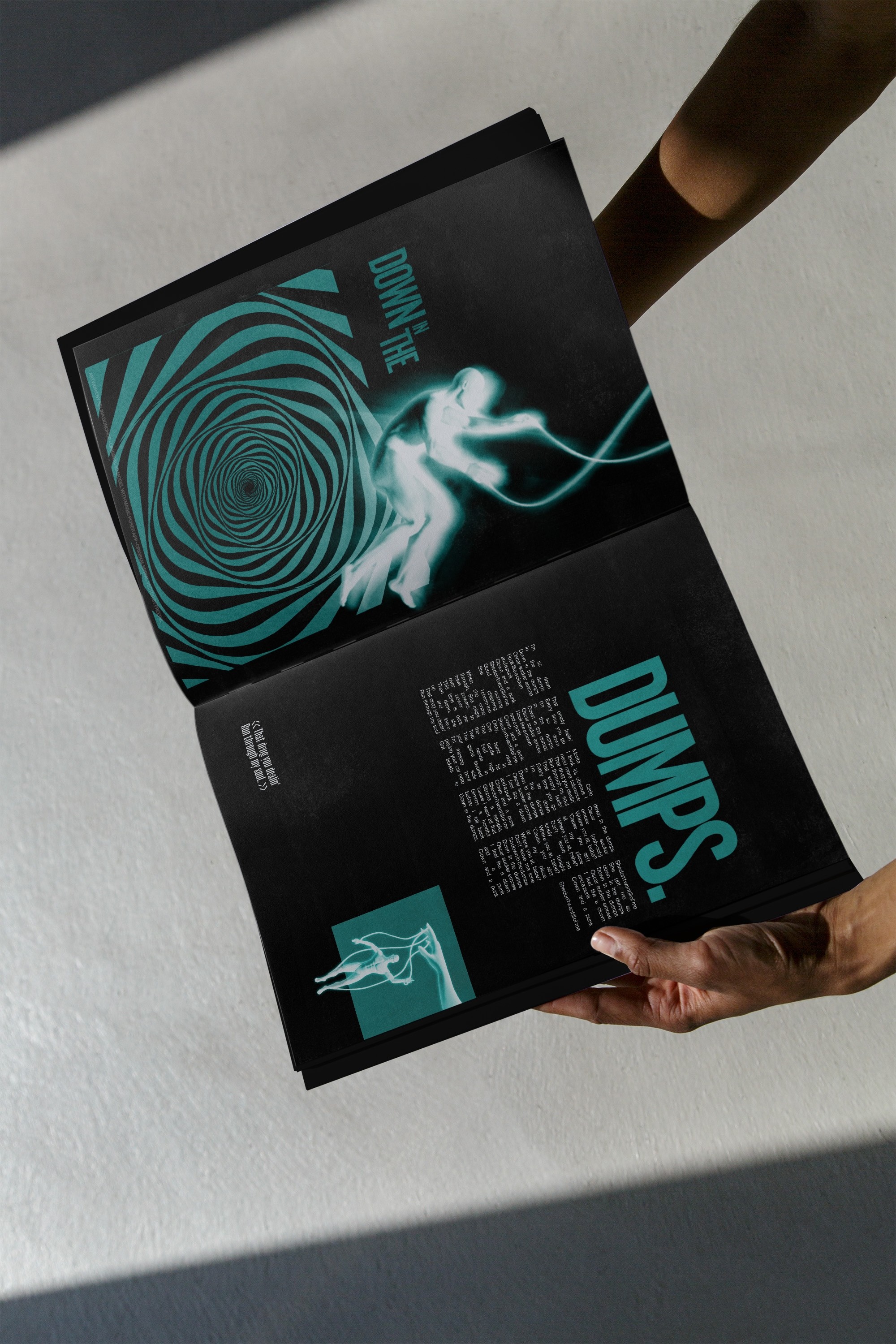
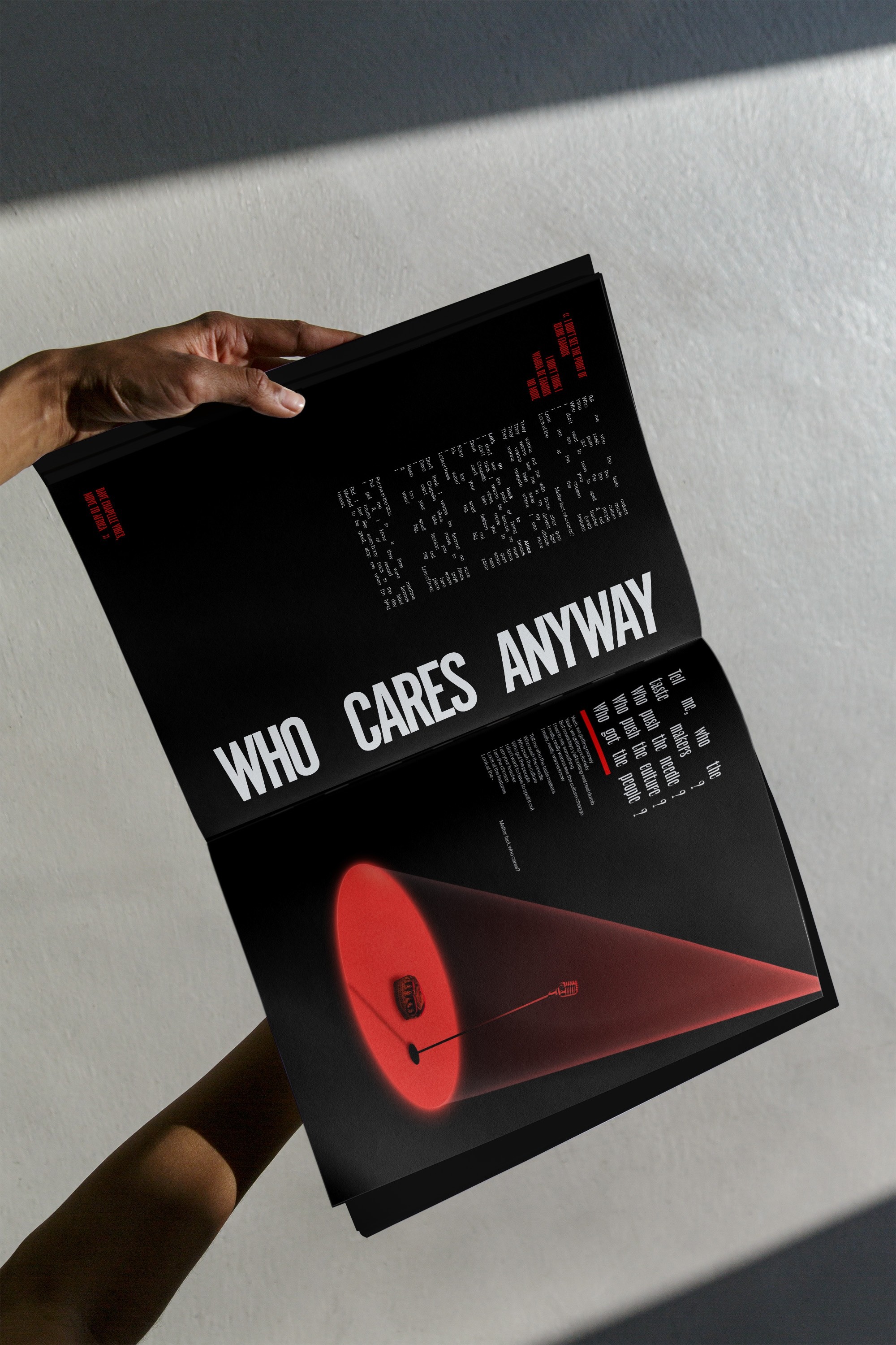
Drawing on the sounds of the self-titled album by the RnB / Trap Jazz artist, Masego, and by utilising my experience with having synesthesia – a neurological trait which allows for sensory crossovers to occur – each spread of this lyric book translates the harmonies & grooves of each track into typography & colour. By setting limitations such as black pages and consistent typefaces, each spread highlights one select colour (the one I associate with the song), and utilises core principles of design such as hierachy & proximity to embody the feel of each song, enhanced by one hero graphic taken from my mind's eye.
This passion project served as an exercise in creating dynamic, engaging layouts through the use, and the breaking of, underlying grid structures – one of my favourite practices in graphic design.